Forum Post: Making a flag.
Posted 14 years ago on Oct. 15, 2011, 1:42 p.m. EST by occupythewest
(46)
This content is user submitted and not an official statement
I am trying to make a flag to carry to a rally in Seattle. I need like 2 or 3 colors that I can use in it. What colors should I use and what should I say they mean. I know that there should be a white in it and I was thinking about putting the fist on the flag in white.
Thanks, Occupythewest [EDIT]
Here is what I have so far. Tell me what is best.
http://i1219.photobucket.com/albums/dd436/mhuntar/starflagtext.jpg
http://i1219.photobucket.com/albums/dd436/mhuntar/rby-text.jpg
http://i1219.photobucket.com/albums/dd436/mhuntar/rb-text.jpg
http://i1219.photobucket.com/albums/dd436/mhuntar/flag1text.jpg
http://i1219.photobucket.com/albums/dd436/mhuntar/1text.jpg
And, special thanks to OpenSky, the Phoenix Flag: http://i1219.photobucket.com/albums/dd436/mhuntar/phoenixflag.jpg
How about a flag with 99 stars?
Haha, well, I think that would be just a little too complex and hard to make. Stars would overwhelm the flag :)
That was my point. An American flag with 99 stars crammed into the blue field would make the point that our group is large.
Well it would be a good statement flag. Wouldn't make 2 or 3 prob though.
http://www.flickr.com/photos/68661603@N08/6240108374/
This is one some of us have been pushing for
Looks cool man. Mind if I texture it an put it up?
sure :) title it phoenix flag so people know what it is though (just in case)
Thanks. Check it out, it looks good.
it looks great! what program/plugin did you use?
Glad you like it. I used Photoshop. Simply displaced the image using a b/w version of the texture then burned the texture onto that. :)
be thankful
50% of the world lives on $2 a day or less. People in Africa are starving. In some countries like England they spend tax payer money on a King and Queen that did nothing to earn their title. Mexicans die trying to cross our border just to work hard and make less than 90% of the Americans. People have family members dying of cancer, and you consider taking money from the rich instead of being thankful for how good the US really is.
Half of what you described is caused by the rich. It's so hard for people out there because of the market system created by the rich and banks. And people are desperate for fairness and a good life that they come here thinking that they will get it just to be put into continual financial bondage by the rich who get richer off the backs of poor immigrants looking for a better life
what is caused by the rich
The poverty you describe. Guess what. If the 1% have most of the wealth, 99% doesn't. Now go spam some other post and please leave my flag idea alone.
how is that spam you guys fail to realize that america is better than everywhere else. how much money does that 99% give to charity on a percentage basis and the problem is that americans only care about themselves. Ask any african kid whose parents died from AIDS would he like to live in America, and he would like it just how it is
He would want to live here because of a dream that no longer exists
if you give up then it doesn't exist for you, but it exists for everyone that comes here. Mexicans come here to triple their wages, if you think making $2 a day is better then you can go try it.
Occupy the west, then why do they still come here?
They triple wages in a country where everything is more expensive. Not much changes
PLEASE... consider using a regular American flag. And let's have PLENTY of regular flags flapping in the winds of change!
The American people must realize ASAP that the OWS is a quintessentially American movement. They are the Great Patriots of today and the quicker they are seen and recognized as such, THE MORE ENTHUSIASTICALLY THEY WILL BE EMBRACED by the American people as their true LIBERATORS.
Once that is achieved, the Dems and the Repugs can just fade into the night like a bad dream...
Well fly that flag too. But since everyone waves it I think we need a few that define us just like the tea party has their don't tread on me
http://occupywallst.org/forum/the-flag/ ...please have a look at this... this flag has long in my mind....
I strongly advise not making a flag! I assure you it will weaken the movement and alienate many middle class would-be participants, the military families, etc..etc.. The stars and stripes is was and always shall be our flag (its cool too). When the tea party pulled out the 'Don't Tread On Me' flag (its cool too), I immediately knew they were kooky. Trust me -- very bad idea.
They were kooky flag or no flag. Flags help express an opinion easily and can be readily identifiable to a movement or be used simply as a method of expression for an individual, such as myself. I'm not saying don't use the stars and stripes, I highly encourage using it, but I also want something that I can personally carry.
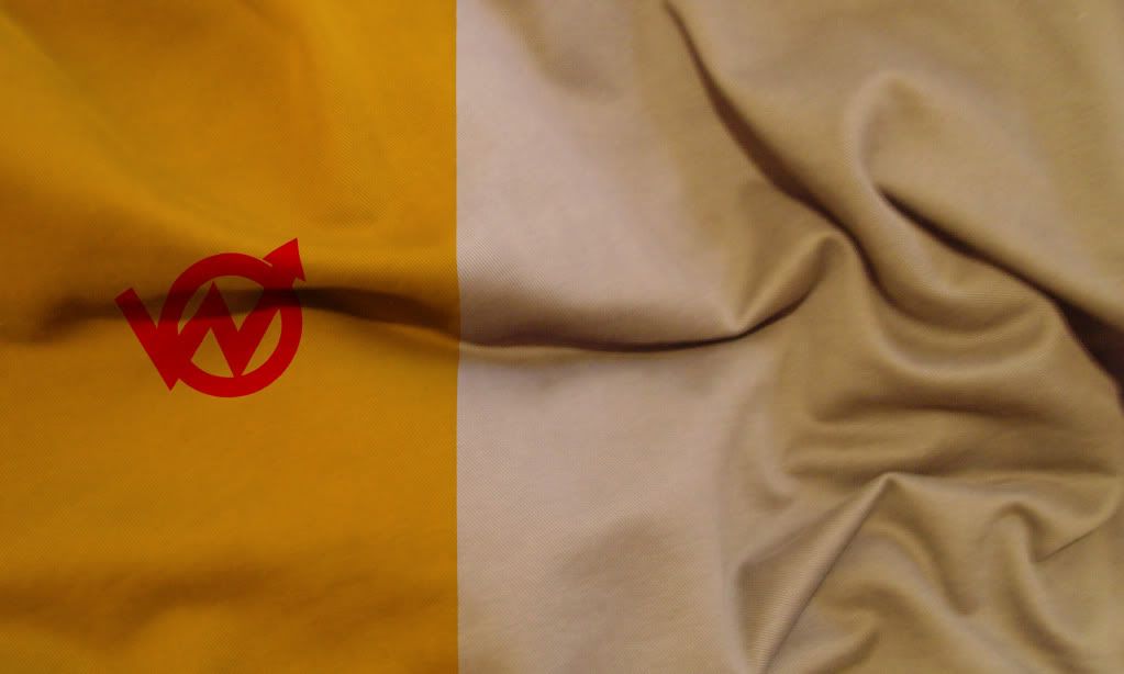
I vote for................http://i1219.photobucket.com/albums/dd436/mhuntar/flag1text.jpg
how about having a very thin stripe on one side, about 1% of the width?
I actually did a mockup of that but found that a thin 1% strip was only a little over half an inch. Can't really be seen and almost not worth the effort sewing on. That's where I got the broken ring idea, as a substitute. I only planned for a 3'x5 flag, the idea may work better on a larger flag.
then do it at 5%, which i think should have been the number all along.
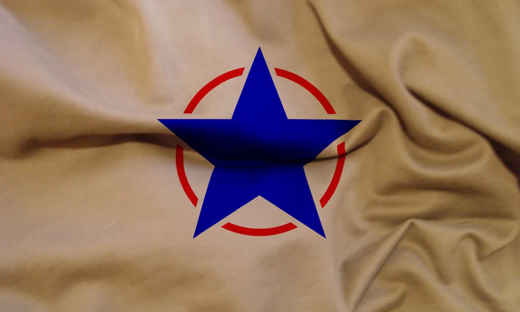
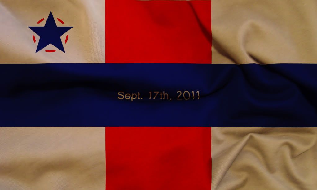
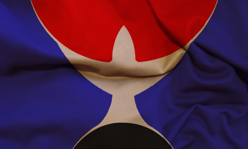
NOTE: The star isn't well explained. I had a blue star (the99%) breaking through the bonds of corporate control (the 1%/red circle)
Hey man, I am also in the NW, and will be joining Seattle soon myself! lol awesome. This is so awesome. You make a flag that comes from your heart. No need to take anyone elses opinion, make it yours. Support the occupation movement and its artists. http://www.youtube.com/watch?v=reazEr_AIBk
Yea man. I'm like 3 hours away in pasco but gonna try to make it. Gonna be great.
How about a single solid red line in the shape of the graph that represents the disparity in wealth in this country over the last 100 years. You can find it online, the graph shows from left to right the income inequality through the years, the higher the point on graph the more lopsided the country is. There are only two high points on the graph one during great depression and one now.
Maybe not a graph but I could incorporate a shape to illustrate the narrowing of wealth. A triangle maybe
what's the matter with red white and blue? one big white star with red/blue borders or red and blue rays shooting out of the center star
For the simple design I may just use a star. For the complex a logo. But the colors would be a good idea. I'm just trying to find the colors that most define this movement and I do think red, white, and blue works for us all.
https://lh6.googleusercontent.com/-R60AWx-L9oI/TpmDiHs6eYI/AAAAAAAACCU/-mtB3YZdzJg/s400/OWSlogo2.jpg
I like the design. I'm thinking about 2 flags. 1 with just colors that can be easily sewn together by anyone at home. And 1 with a logo.
You can use this design any way you want. If you need larger image, or file in other format, email me: admin@superunion.org
Okay thanks. That should work but if it doesn't I'll shoot you an email :)
Cool.
http://i1219.photobucket.com/albums/dd436/mhuntar/starflagtext.jpg http://i1219.photobucket.com/albums/dd436/mhuntar/rby-text.jpg http://i1219.photobucket.com/albums/dd436/mhuntar/rb-text.jpg http://i1219.photobucket.com/albums/dd436/mhuntar/flag1text.jpg http://i1219.photobucket.com/albums/dd436/mhuntar/1text.jpg
If you are asking for my opinion, I like http://i1219.photobucket.com/albums/dd436/mhuntar/rby-text.jpg and http://i1219.photobucket.com/albums/dd436/mhuntar/1text.jpg symbol/background combinations. I don't understand if the blue is part of the flag or an option, but I'd drop it.
The star is good everywhere, except http://i1219.photobucket.com/albums/dd436/mhuntar/flag1text.jpg might be too heavy on symbolism. And the circle - I don't see the need of circle around the star.
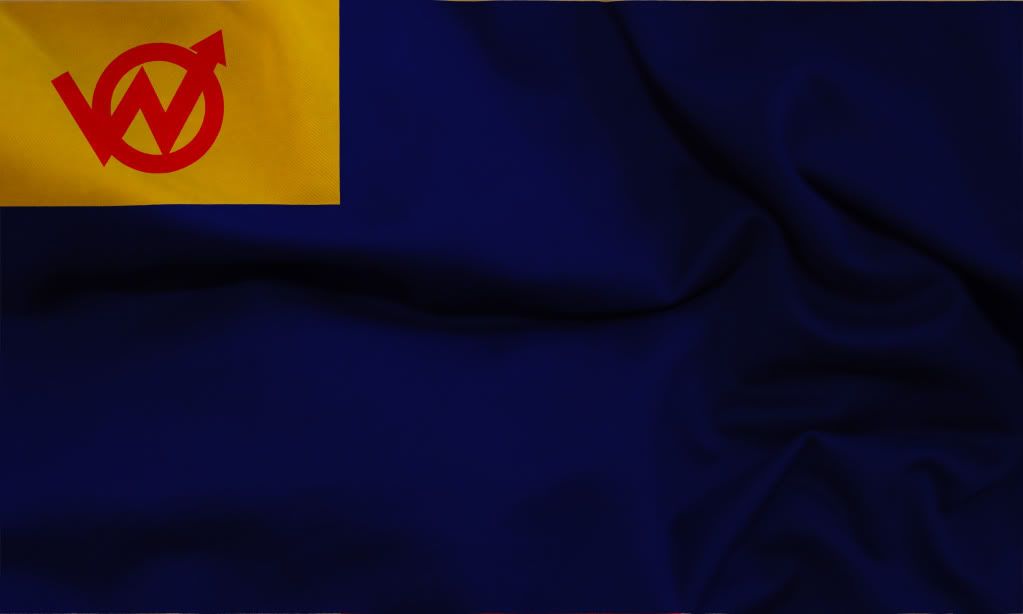
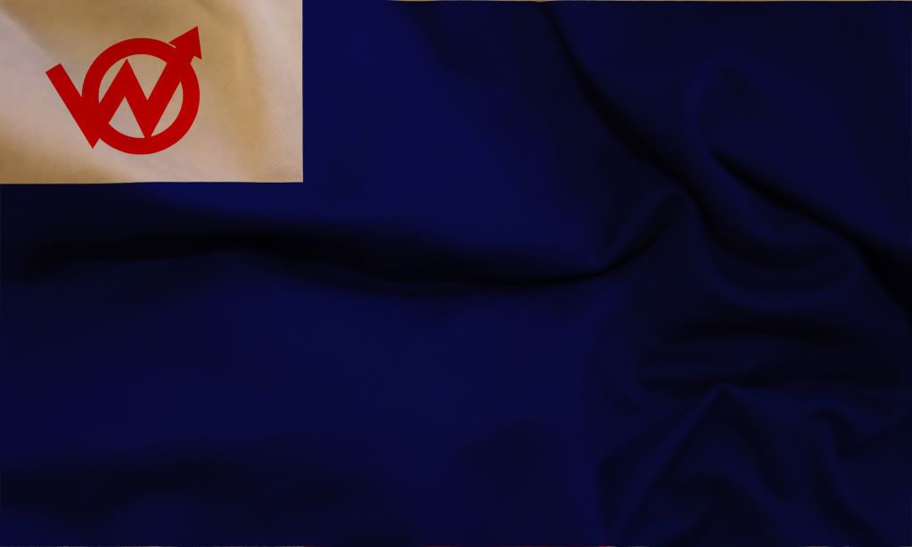
About the logo: I made it out of another symbol, spraypainted on a board carried in NY by an anonymous dude. I think this symbol is the best fit, cause it's not invented or forced by a designer, but, sort of appeared organically.
Regarding the colors, I, personally, never see any significance in them. When I see blue I don't just think one thing. Or red. In my opinion the more contrast the better if you need to show the symbol. Or just go for the beauty. But with the flags you gotta be careful about heraldic meanings.
People here were talking about red symbol on white.
Okay, I'll work on some options. I just chose the colors cause they're simple and easy to get hands on. The star isn't well explained. I had a blue star (the99%) breaking through the bonds of corporate control (Red circle/1%)
I added blue to that first flag just to try to get rid of the large amount of white cause it looked more like a white flag and the blue fixes that. That 2nd one I added the yellow rather than just leave red and white cause once again the white overwhelmed the symbol.
Thanks man for your logo. Hope you like my options.
DUDE< where's the WEEEEEEED flag? I'm so high right now.
Really? Like that would help us bring people in. Troll
Smoke more weed. that's what i'm doing. It's attracting people I like.